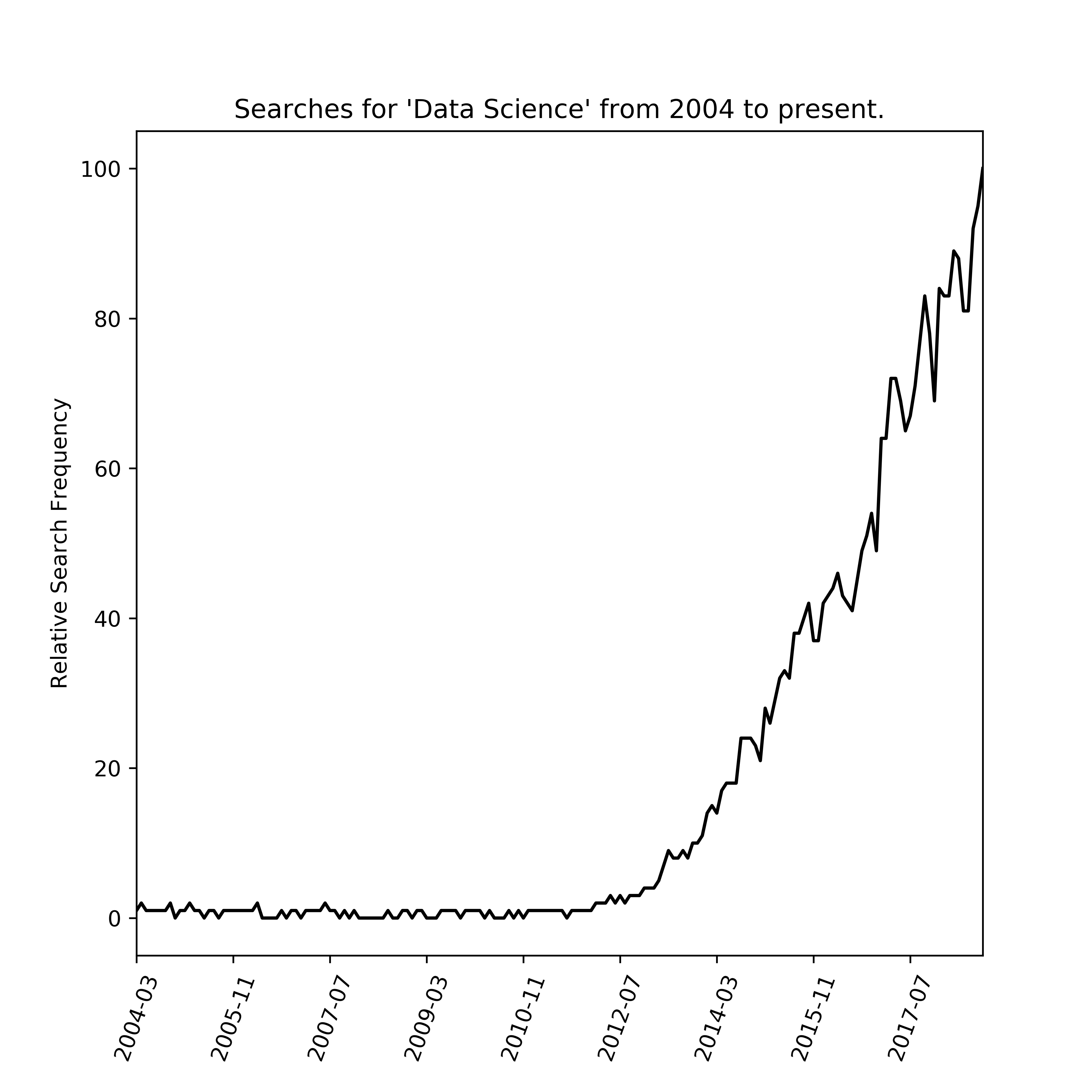
First, get the data by clicking the download button here. https://trends.google.com/trends/explore?date=all&geo=US&q=%22data%20science%22
Save the resulting csv to your notebook's directory.
import pandas as pd
import matplotlib.pyplot as plt
# import the data
df=pd.read_csv("multiTimeline.csv")
# rename columns
df.columns=['numbers']
# this is all strings, so convert it to int-convertable format
df=df.replace('<1','0')
# drop the first column, which is colnames
df=df.iloc[1:,:]
#change the strings to numbers
df.numbers=df.numbers.astype('int32')
#plot the result
% matplotlib inline
fig, ax = plt.subplots()
fig = df.plot(
    y='numbers',
    kind='line',
    ax=ax,
    figsize=(7,7),
    title = "Searches for 'Data Science' from 2004 to present.",
    legend = False,
    color = 'k'
        )
plt.ylabel("Relative Search Frequency")
plt.xticks(rotation=70)
plt.savefig('ds_search_result.png', dpi=600)
plt.show()